注意
转到末尾以下载完整示例代码,或通过 JupyterLite 或 Binder 在浏览器中运行此示例。
比较不同缩放器对含异常值数据的影响#
加利福尼亚住房数据集(California Housing dataset)中的特征 0(街区中位数收入)和特征 5(平均房屋入住率)具有非常不同的尺度,并且包含一些非常大的异常值。这两个特点导致数据可视化困难,更重要的是,它们会降低许多机器学习算法的预测性能。未经缩放的数据还会减慢甚至阻止许多基于梯度的估计器的收敛。
实际上,许多估计器的设计都基于这样的假设:每个特征的值接近于零,或者更重要的是,所有特征都在可比较的尺度上变化。特别是,基于度量和基于梯度的估计器通常假设数据近似标准化(中心化特征,单位方差)。一个值得注意的例外是基于决策树的估计器,它们对数据的任意缩放都具有鲁棒性。
此示例使用不同的缩放器(scaler)、转换器(transformer)和归一化器(normalizer),将数据调整到预定义的范围之内。
缩放器是线性(更精确地说是仿射)转换器,它们在估计用于平移和缩放每个特征的参数方式上彼此不同。
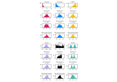
QuantileTransformer 提供非线性变换,其中边缘异常值和内点之间的距离被缩小。PowerTransformer 提供非线性变换,其中数据被映射到正态分布以稳定方差并最小化偏度。
与之前的变换不同,归一化指的是逐样本变换,而不是逐特征变换。
以下代码有些冗长,您可以直接跳到结果分析部分。
# Authors: The scikit-learn developers
# SPDX-License-Identifier: BSD-3-Clause

import matplotlib as mpl
import numpy as np
from matplotlib import cm
from matplotlib import pyplot as plt

from sklearn.datasets import fetch_california_housing
from sklearn.preprocessing import (
    MaxAbsScaler,
    MinMaxScaler,
    Normalizer,
    PowerTransformer,
    QuantileTransformer,
    RobustScaler,
    StandardScaler,
    minmax_scale,
)

dataset = fetch_california_housing()
X_full, y_full = dataset.data, dataset.target
feature_names = dataset.feature_names

feature_mapping = {
    "MedInc": "Median income in block",
    "HouseAge": "Median house age in block",
    "AveRooms": "Average number of rooms",
    "AveBedrms": "Average number of bedrooms",
    "Population": "Block population",
    "AveOccup": "Average house occupancy",
    "Latitude": "House block latitude",
    "Longitude": "House block longitude",
}

# Take only 2 features to make visualization easier
# Feature MedInc has a long tail distribution.
# Feature AveOccup has a few but very large outliers.
features = ["MedInc", "AveOccup"]
features_idx = [feature_names.index(feature) for feature in features]
X = X_full[:, features_idx]
distributions = [
    ("Unscaled data", X),
    ("Data after standard scaling", StandardScaler().fit_transform(X)),
    ("Data after min-max scaling", MinMaxScaler().fit_transform(X)),
    ("Data after max-abs scaling", MaxAbsScaler().fit_transform(X)),
    (
        "Data after robust scaling",
        RobustScaler(quantile_range=(25, 75)).fit_transform(X),
    ),
    (
        "Data after power transformation (Yeo-Johnson)",
        PowerTransformer(method="yeo-johnson").fit_transform(X),
    ),
    (
        "Data after power transformation (Box-Cox)",
        PowerTransformer(method="box-cox").fit_transform(X),
    ),
    (
        "Data after quantile transformation (uniform pdf)",
        QuantileTransformer(
            output_distribution="uniform", random_state=42
        ).fit_transform(X),
    ),
    (
        "Data after quantile transformation (gaussian pdf)",
        QuantileTransformer(
            output_distribution="normal", random_state=42
        ).fit_transform(X),
    ),
    ("Data after sample-wise L2 normalizing", Normalizer().fit_transform(X)),
]

# scale the output between 0 and 1 for the colorbar
y = minmax_scale(y_full)

# plasma does not exist in matplotlib < 1.5
cmap = getattr(cm, "plasma_r", cm.hot_r)


def create_axes(title, figsize=(16, 6)):
    fig = plt.figure(figsize=figsize)
    fig.suptitle(title)

    # define the axis for the first plot
    left, width = 0.1, 0.22
    bottom, height = 0.1, 0.7
    bottom_h = height + 0.15
    left_h = left + width + 0.02

    rect_scatter = [left, bottom, width, height]
    rect_histx = [left, bottom_h, width, 0.1]
    rect_histy = [left_h, bottom, 0.05, height]

    ax_scatter = plt.axes(rect_scatter)
    ax_histx = plt.axes(rect_histx)
    ax_histy = plt.axes(rect_histy)

    # define the axis for the zoomed-in plot
    left = width + left + 0.2
    left_h = left + width + 0.02

    rect_scatter = [left, bottom, width, height]
    rect_histx = [left, bottom_h, width, 0.1]
    rect_histy = [left_h, bottom, 0.05, height]

    ax_scatter_zoom = plt.axes(rect_scatter)
    ax_histx_zoom = plt.axes(rect_histx)
    ax_histy_zoom = plt.axes(rect_histy)

    # define the axis for the colorbar
    left, width = width + left + 0.13, 0.01

    rect_colorbar = [left, bottom, width, height]
    ax_colorbar = plt.axes(rect_colorbar)

    return (
        (ax_scatter, ax_histy, ax_histx),
        (ax_scatter_zoom, ax_histy_zoom, ax_histx_zoom),
        ax_colorbar,
    )


def plot_distribution(axes, X, y, hist_nbins=50, title="", x0_label="", x1_label=""):
    ax, hist_X1, hist_X0 = axes

    ax.set_title(title)
    ax.set_xlabel(x0_label)
    ax.set_ylabel(x1_label)

    # The scatter plot
    colors = cmap(y)
    ax.scatter(X[:, 0], X[:, 1], alpha=0.5, marker="o", s=5, lw=0, c=colors)

    # Removing the top and the right spine for aesthetics
    # make nice axis layout
    ax.spines["top"].set_visible(False)
    ax.spines["right"].set_visible(False)
    ax.get_xaxis().tick_bottom()
    ax.get_yaxis().tick_left()
    ax.spines["left"].set_position(("outward", 10))
    ax.spines["bottom"].set_position(("outward", 10))

    # Histogram for axis X1 (feature 5)
    hist_X1.set_ylim(ax.get_ylim())
    hist_X1.hist(
        X[:, 1], bins=hist_nbins, orientation="horizontal", color="grey", ec="grey"
    )
    hist_X1.axis("off")

    # Histogram for axis X0 (feature 0)
    hist_X0.set_xlim(ax.get_xlim())
    hist_X0.hist(
        X[:, 0], bins=hist_nbins, orientation="vertical", color="grey", ec="grey"
    )
    hist_X0.axis("off")
每个缩放器/归一化器/转换器将显示两个图。左图将显示完整数据集的散点图,而右图将排除极端值,仅考虑数据集的 99%,排除边缘异常值。此外,每个特征的边缘分布将显示在散点图的两侧。
def make_plot(item_idx):
    title, X = distributions[item_idx]
    ax_zoom_out, ax_zoom_in, ax_colorbar = create_axes(title)
    axarr = (ax_zoom_out, ax_zoom_in)
    plot_distribution(
        axarr[0],
        X,
        y,
        hist_nbins=200,
        x0_label=feature_mapping[features[0]],
        x1_label=feature_mapping[features[1]],
        title="Full data",
    )

    # zoom-in
    zoom_in_percentile_range = (0, 99)
    cutoffs_X0 = np.percentile(X[:, 0], zoom_in_percentile_range)
    cutoffs_X1 = np.percentile(X[:, 1], zoom_in_percentile_range)

    non_outliers_mask = np.all(X > [cutoffs_X0[0], cutoffs_X1[0]], axis=1) & np.all(
        X < [cutoffs_X0[1], cutoffs_X1[1]], axis=1
    )
    plot_distribution(
        axarr[1],
        X[non_outliers_mask],
        y[non_outliers_mask],
        hist_nbins=50,
        x0_label=feature_mapping[features[0]],
        x1_label=feature_mapping[features[1]],
        title="Zoom-in",
    )

    norm = mpl.colors.Normalize(y_full.min(), y_full.max())
    mpl.colorbar.ColorbarBase(
        ax_colorbar,
        cmap=cmap,
        norm=norm,
        orientation="vertical",
        label="Color mapping for values of y",
    )
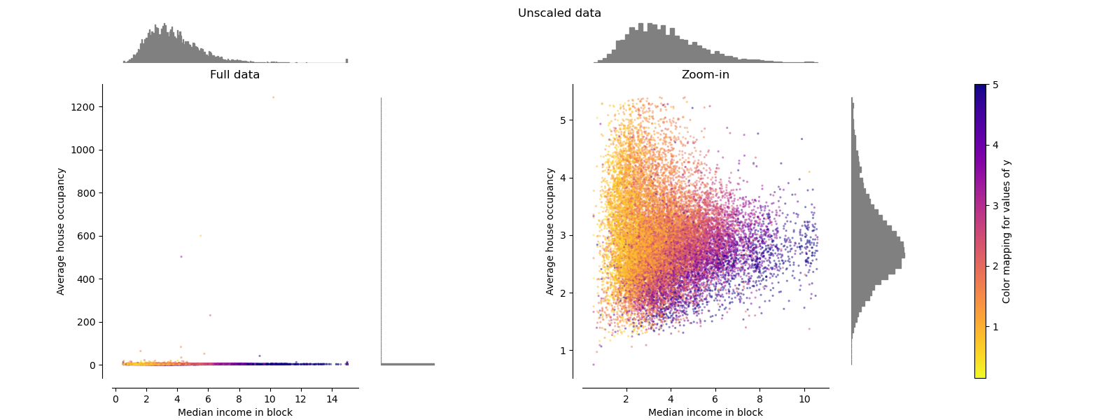
原始数据#
每个变换都绘制成图,显示两个变换后的特征,其中左图显示整个数据集,右图放大显示不含边缘异常值的数据集。绝大多数样本被压缩到特定范围:中位数收入为 [0, 10],平均房屋入住率为 [0, 6]。请注意,存在一些边缘异常值(某些街区的平均入住率超过 1200)。因此,根据应用的不同,特定的预处理可能会非常有益。下面,我们将介绍这些预处理方法在存在边缘异常值时的一些见解和行为。
make_plot(0)
StandardScaler#
StandardScaler 移除均值并将数据缩放至单位方差。缩放会缩小特征值的范围,如下图左侧所示。然而,在计算经验均值和标准差时,异常值会产生影响。特别要注意的是,由于每个特征上的异常值具有不同的量级,因此变换后数据在每个特征上的分布非常不同:对于变换后的中位数收入特征,大部分数据位于 [-2, 4] 范围内,而对于变换后的平均房屋入住率,相同的数据则被压缩在较小的 [-0.2, 0.2] 范围内。
因此,在存在异常值的情况下,StandardScaler 无法保证平衡的特征尺度。
make_plot(1)

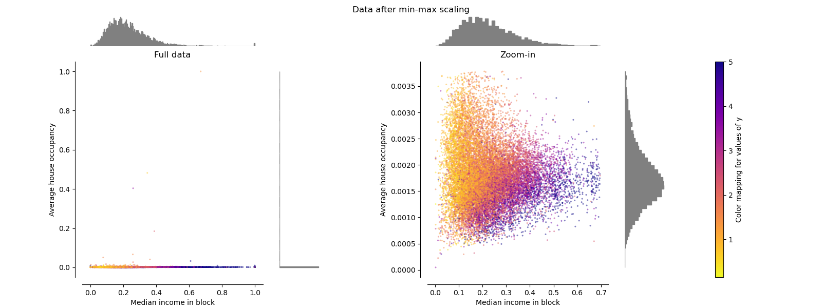
MinMaxScaler#
MinMaxScaler 重新缩放数据集,使所有特征值都在 [0, 1] 范围内,如下图右侧面板所示。然而,这种缩放将所有内点压缩到变换后的平均房屋入住率的狭窄范围 [0, 0.005] 中。
无论是 StandardScaler 还是 MinMaxScaler 都对异常值的存在非常敏感。
make_plot(2)
MaxAbsScaler#
MaxAbsScaler 类似于 MinMaxScaler,不同之处在于,根据是否存在负值或正值,值会被映射到多个范围。如果只存在正值,范围是 [0, 1]。如果只存在负值,范围是 [-1, 0]。如果正负值都存在,范围是 [-1, 1]。在只有正值的数据上,MinMaxScaler 和 MaxAbsScaler 的行为相似。因此,MaxAbsScaler 也受大型异常值的影响。
make_plot(3)

RobustScaler#
与之前的缩放器不同,RobustScaler 的中心化和缩放统计数据基于百分位数,因此不受少数非常大的边缘异常值的影响。因此,变换后的特征值的范围比之前的缩放器更大,更重要的是,它们大致相似:对于这两个特征,大多数变换后的值都在 [-2, 3] 范围内,如放大图中所示。请注意,异常值本身仍然存在于变换后的数据中。如果需要单独进行异常值裁剪,则需要非线性变换(见下文)。
make_plot(4)

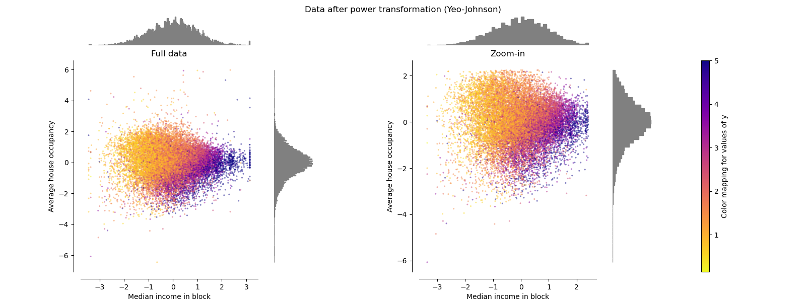
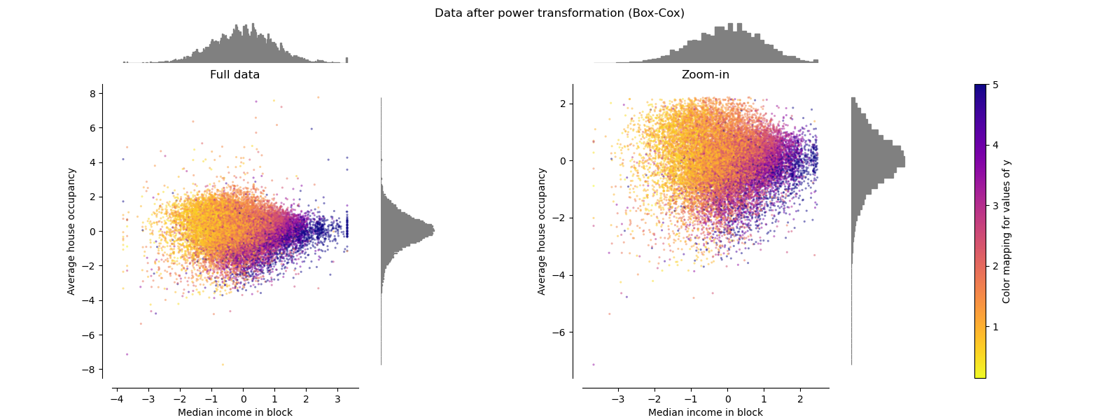
PowerTransformer#
PowerTransformer 对每个特征应用幂变换,使数据更接近高斯分布,以稳定方差并最小化偏度。目前支持 Yeo-Johnson 和 Box-Cox 变换,两种方法中的最优缩放因子均通过最大似然估计确定。默认情况下,PowerTransformer 应用零均值、单位方差归一化。请注意,Box-Cox 只能应用于严格正数的数据。收入和平均房屋入住率恰好是严格正数,但如果存在负值,则首选 Yeo-Johnson 变换。
make_plot(5)
make_plot(6)
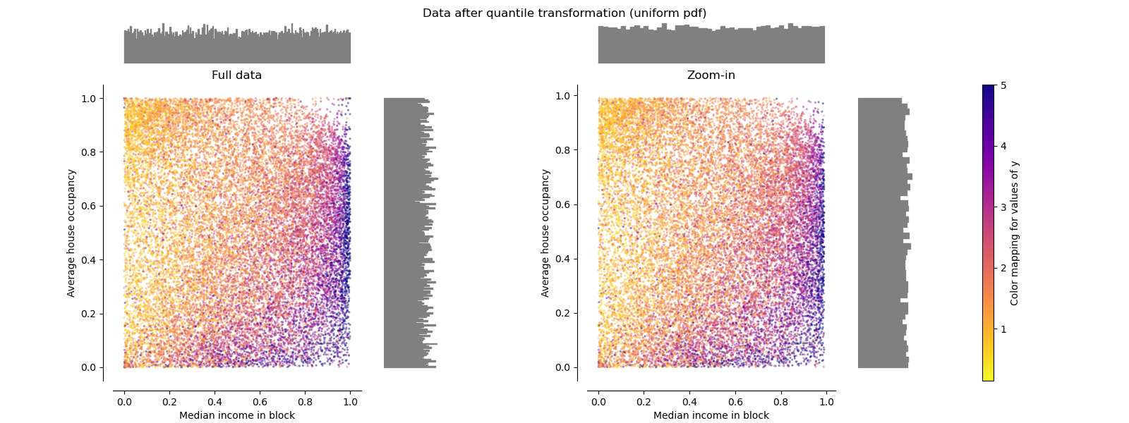
QuantileTransformer(均匀分布输出)#
QuantileTransformer 应用非线性变换,使得每个特征的概率密度函数将被映射到均匀分布或高斯分布。在这种情况下,所有数据(包括异常值)都将被映射到范围 [0, 1] 的均匀分布,从而使异常值与内点无法区分。
RobustScaler 和 QuantileTransformer 对异常值具有鲁棒性,因为在训练集中添加或移除异常值将产生近似相同的变换。但与 RobustScaler 不同,QuantileTransformer 还会通过将任何异常值设置为预先定义的范围边界(0 和 1)来自动“折叠”它们。这可能导致极端值出现饱和伪影。
make_plot(7)
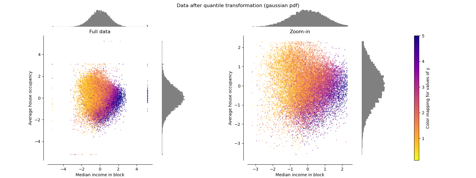
QuantileTransformer(高斯分布输出)#
要映射到高斯分布,请将参数 output_distribution='normal'。
make_plot(8)
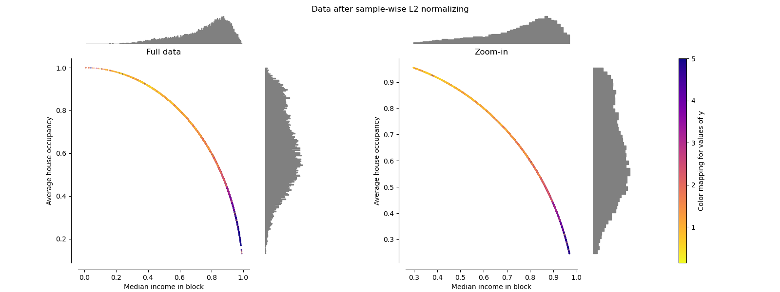
Normalizer#
Normalizer 对每个样本的向量进行重新缩放,使其具有单位范数,这与样本的分布无关。从下图两幅图中可以看出,所有样本都被映射到单位圆上。在我们的示例中,所选的两个特征仅具有正值;因此,变换后的数据仅位于正象限。如果某些原始特征混合了正负值,则情况并非如此。
make_plot(9)

plt.show()
脚本总运行时间: (0 分 8.537 秒)
相关示例