注意
转到末尾 下载完整示例代码或通过 JupyterLite 或 Binder 在浏览器中运行此示例。
偏依赖图和个体条件期望图#
偏依赖图显示了目标函数 [2] 与一组感兴趣的特征之间的依赖关系,通过对所有其他特征(互补特征)的值进行边缘化处理。由于人类感知的限制,感兴趣特征集的大小必须很小(通常为一到两个),因此它们通常从最重要的特征中选择。
类似地,个体条件期望 (ICE) 图 [3] 显示了目标函数与感兴趣特征之间的依赖关系。然而,与显示感兴趣特征的平均效应的偏依赖图不同,ICE 图分别可视化了每个 样本 的预测对特征的依赖关系,每条线代表一个样本。ICE 图仅支持一个感兴趣特征。
此示例展示了如何从在共享单车数据集上训练的 MLPRegressor 和 HistGradientBoostingRegressor 中获取偏依赖图和 ICE 图。本示例受 [1] 启发。
# Authors: The scikit-learn developers
# SPDX-License-Identifier: BSD-3-Clause
共享单车数据集预处理#
我们将使用共享单车数据集。目标是使用天气和季节数据以及日期时间信息预测共享单车租赁数量。
from sklearn.datasets import fetch_openml

bikes = fetch_openml("Bike_Sharing_Demand", version=2, as_frame=True)
# Make an explicit copy to avoid "SettingWithCopyWarning" from pandas
X, y = bikes.data.copy(), bikes.target

# We use only a subset of the data to speed up the example.
X = X.iloc[::5, :]
y = y[::5]
特征 "weather" 有一个特殊性:类别 "heavy_rain" 是一个罕见的类别。
X["weather"].value_counts()
weather
clear         2284
misty          904
rain           287
heavy_rain       1
Name: count, dtype: int64
由于这个罕见的类别,我们将其合并到 "rain" 中。
X["weather"] = (
    X["weather"]
    .astype(object)
    .replace(to_replace="heavy_rain", value="rain")
    .astype("category")
)
现在我们仔细看看 "year" 特征
X["year"].value_counts()
year
1    1747
0    1729
Name: count, dtype: int64
我们看到我们有两年的数据。我们使用第一年训练模型,第二年测试模型。
mask_training = X["year"] == 0.0
X = X.drop(columns=["year"])
X_train, y_train = X[mask_training], y[mask_training]
X_test, y_test = X[~mask_training], y[~mask_training]
我们可以检查数据集信息,看看我们有异构数据类型。我们必须相应地预处理不同的列。
X_train.info()
<class 'pandas.core.frame.DataFrame'>
Index: 1729 entries, 0 to 8640
Data columns (total 11 columns):
 #   Column      Non-Null Count  Dtype
---  ------      --------------  -----
 0   season      1729 non-null   category
 1   month       1729 non-null   int64
 2   hour        1729 non-null   int64
 3   holiday     1729 non-null   category
 4   weekday     1729 non-null   int64
 5   workingday  1729 non-null   category
 6   weather     1729 non-null   category
 7   temp        1729 non-null   float64
 8   feel_temp   1729 non-null   float64
 9   humidity    1729 non-null   float64
 10  windspeed   1729 non-null   float64
dtypes: category(4), float64(4), int64(3)
memory usage: 115.4 KB
根据前面的信息,我们将 category 列视为名义分类特征。此外,我们还将日期和时间信息视为分类特征。
我们手动定义包含数值特征和分类特征的列。
numerical_features = [
    "temp",
    "feel_temp",
    "humidity",
    "windspeed",
]
categorical_features = X_train.columns.drop(numerical_features)
在我们深入了解不同机器学习管道的预处理细节之前,我们将尝试对数据集获得一些额外的直观认识,这将有助于理解模型的统计性能和偏依赖分析的结果。
我们通过按季节和年份对数据进行分组来绘制共享单车租赁的平均数量。
from itertools import product

import matplotlib.pyplot as plt
import numpy as np

days = ("Sun", "Mon", "Tue", "Wed", "Thu", "Fri", "Sat")
hours = tuple(range(24))
xticklabels = [f"{day}\n{hour}:00" for day, hour in product(days, hours)]
xtick_start, xtick_period = 6, 12

fig, axs = plt.subplots(nrows=2, figsize=(8, 6), sharey=True, sharex=True)
average_bike_rentals = bikes.frame.groupby(
    ["year", "season", "weekday", "hour"], observed=True
).mean(numeric_only=True)["count"]
for ax, (idx, df) in zip(axs, average_bike_rentals.groupby("year")):
    df.groupby("season", observed=True).plot(ax=ax, legend=True)

    # decorate the plot
    ax.set_xticks(
        np.linspace(
            start=xtick_start,
            stop=len(xticklabels),
            num=len(xticklabels) // xtick_period,
        )
    )
    ax.set_xticklabels(xticklabels[xtick_start::xtick_period])
    ax.set_xlabel("")
    ax.set_ylabel("Average number of bike rentals")
    ax.set_title(
        f"Bike rental for {'2010 (train set)' if idx == 0.0 else '2011 (test set)'}"
    )
    ax.set_ylim(0, 1_000)
    ax.set_xlim(0, len(xticklabels))
    ax.legend(loc=2)
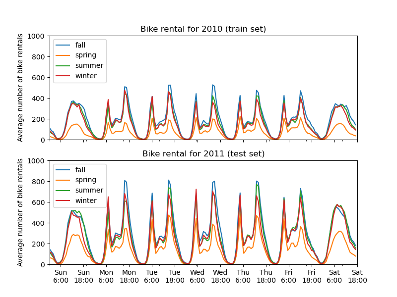
训练集和测试集之间第一个显著差异是测试集中的共享单车租赁数量更高。因此,机器学习模型低估共享单车租赁数量也就不足为奇了。我们还观察到春季共享单车租赁数量较低。此外,我们看到在工作日,上午 6-7 点和下午 5-6 点左右有特定的模式,共享单车租赁数量出现一些高峰。我们可以记住这些不同的见解,并用它们来理解偏依赖图。
机器学习模型的预处理器#
由于我们稍后将使用两种不同的模型,MLPRegressor 和 HistGradientBoostingRegressor,我们为每个模型创建两个不同的预处理器。
神经网络模型的预处理器#
我们将使用 QuantileTransformer 来缩放数值特征,并使用 OneHotEncoder 编码分类特征。
from sklearn.compose import ColumnTransformer
from sklearn.preprocessing import OneHotEncoder, QuantileTransformer

mlp_preprocessor = ColumnTransformer(
    transformers=[
        ("num", QuantileTransformer(n_quantiles=100), numerical_features),
        ("cat", OneHotEncoder(handle_unknown="ignore"), categorical_features),
    ]
)
mlp_preprocessor
梯度提升模型的预处理器#
对于梯度提升模型,我们保持数值特征不变,只使用 OrdinalEncoder 对分类特征进行编码。
from sklearn.preprocessing import OrdinalEncoder

hgbdt_preprocessor = ColumnTransformer(
    transformers=[
        ("cat", OrdinalEncoder(), categorical_features),
        ("num", "passthrough", numerical_features),
    ],
    sparse_threshold=1,
    verbose_feature_names_out=False,
).set_output(transform="pandas")
hgbdt_preprocessor
使用不同模型的 1 维偏依赖#
在本节中,我们将使用两种不同的机器学习模型计算 1 维偏依赖:(i)多层感知器和(ii)梯度提升模型。通过这两个模型,我们将演示如何计算和解释数值和分类特征的偏依赖图 (PDP) 以及个体条件期望 (ICE)。
多层感知器#
让我们拟合一个 MLPRegressor 并计算单变量偏依赖图。
from time import time

from sklearn.neural_network import MLPRegressor
from sklearn.pipeline import make_pipeline

print("Training MLPRegressor...")
tic = time()
mlp_model = make_pipeline(
    mlp_preprocessor,
    MLPRegressor(
        hidden_layer_sizes=(30, 15),
        learning_rate_init=0.01,
        early_stopping=True,
        random_state=0,
    ),
)
mlp_model.fit(X_train, y_train)
print(f"done in {time() - tic:.3f}s")
print(f"Test R2 score: {mlp_model.score(X_test, y_test):.2f}")
Training MLPRegressor...
done in 0.563s
Test R2 score: 0.61
我们使用专门为神经网络创建的预处理器配置了一个管道,并调整了神经网络的大小和学习率,以在训练时间与测试集上的预测性能之间取得合理的折衷。
重要的是,这个表格数据集的特征具有非常不同的动态范围。神经网络对具有不同尺度的特征非常敏感,忘记预处理数字特征会导致模型性能非常差。
使用更大的神经网络可以获得更高的预测性能,但训练成本也会显著增加。
请注意,在绘制偏依赖图之前,检查模型在测试集上的准确性是否足够重要,因为解释给定特征对预测性能较差的模型预测函数的影响几乎没有用。在这方面,我们的 MLP 模型表现良好。
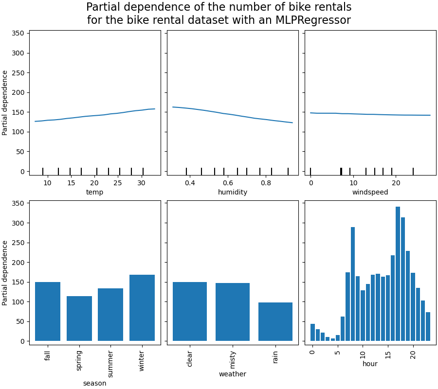
我们将绘制平均偏依赖。
import matplotlib.pyplot as plt

from sklearn.inspection import PartialDependenceDisplay

common_params = {
    "subsample": 50,
    "n_jobs": 2,
    "grid_resolution": 20,
    "random_state": 0,
}

print("Computing partial dependence plots...")
features_info = {
    # features of interest
    "features": ["temp", "humidity", "windspeed", "season", "weather", "hour"],
    # type of partial dependence plot
    "kind": "average",
    # information regarding categorical features
    "categorical_features": categorical_features,
}
tic = time()
_, ax = plt.subplots(ncols=3, nrows=2, figsize=(9, 8), constrained_layout=True)
display = PartialDependenceDisplay.from_estimator(
    mlp_model,
    X_train,
    **features_info,
    ax=ax,
    **common_params,
)
print(f"done in {time() - tic:.3f}s")
_ = display.figure_.suptitle(
    (
        "Partial dependence of the number of bike rentals\n"
        "for the bike rental dataset with an MLPRegressor"
    ),
    fontsize=16,
)
Computing partial dependence plots...
done in 0.468s
梯度提升#
现在,让我们拟合一个 HistGradientBoostingRegressor 并计算相同特征的偏依赖。我们还使用为此模型创建的专用预处理器。
from sklearn.ensemble import HistGradientBoostingRegressor

print("Training HistGradientBoostingRegressor...")
tic = time()
hgbdt_model = make_pipeline(
    hgbdt_preprocessor,
    HistGradientBoostingRegressor(
        categorical_features=categorical_features,
        random_state=0,
        max_iter=50,
    ),
)
hgbdt_model.fit(X_train, y_train)
print(f"done in {time() - tic:.3f}s")
print(f"Test R2 score: {hgbdt_model.score(X_test, y_test):.2f}")
Training HistGradientBoostingRegressor...
done in 0.111s
Test R2 score: 0.62
在这里,我们使用梯度提升模型的默认超参数,无需任何预处理,因为基于树的模型天然对数值特征的单调变换具有鲁棒性。
请注意,在这个表格数据集上,梯度提升机器的训练速度显著快于神经网络,并且准确性也更高。调整其超参数也显著便宜(默认值通常效果很好,而神经网络通常并非如此)。
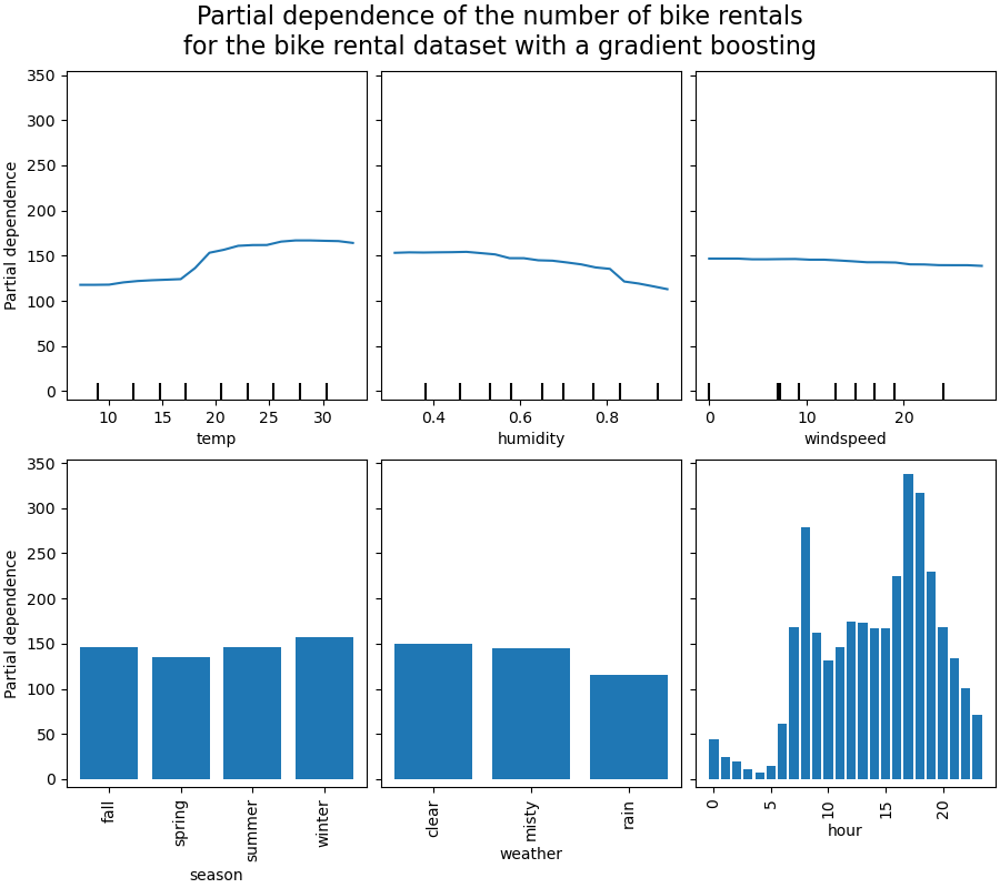
我们将绘制一些数值和分类特征的偏依赖图。
print("Computing partial dependence plots...")
tic = time()
_, ax = plt.subplots(ncols=3, nrows=2, figsize=(9, 8), constrained_layout=True)
display = PartialDependenceDisplay.from_estimator(
    hgbdt_model,
    X_train,
    **features_info,
    ax=ax,
    **common_params,
)
print(f"done in {time() - tic:.3f}s")
_ = display.figure_.suptitle(
    (
        "Partial dependence of the number of bike rentals\n"
        "for the bike rental dataset with a gradient boosting"
    ),
    fontsize=16,
)
Computing partial dependence plots...
done in 0.948s
图的分析#
我们首先来看数值特征的 PDP。对于这两个模型,温度 PDP 的总体趋势是自行车租赁数量随温度升高而增加。我们可以进行类似的分析,但湿度特征呈现相反的趋势。湿度增加时,自行车租赁数量减少。最后,我们看到风速特征也呈现相同的趋势。对于这两个模型,风速增加时,自行车租赁数量减少。我们还观察到 MLPRegressor 的预测比 HistGradientBoostingRegressor 平滑得多。
现在,我们将查看分类特征的偏依赖图。
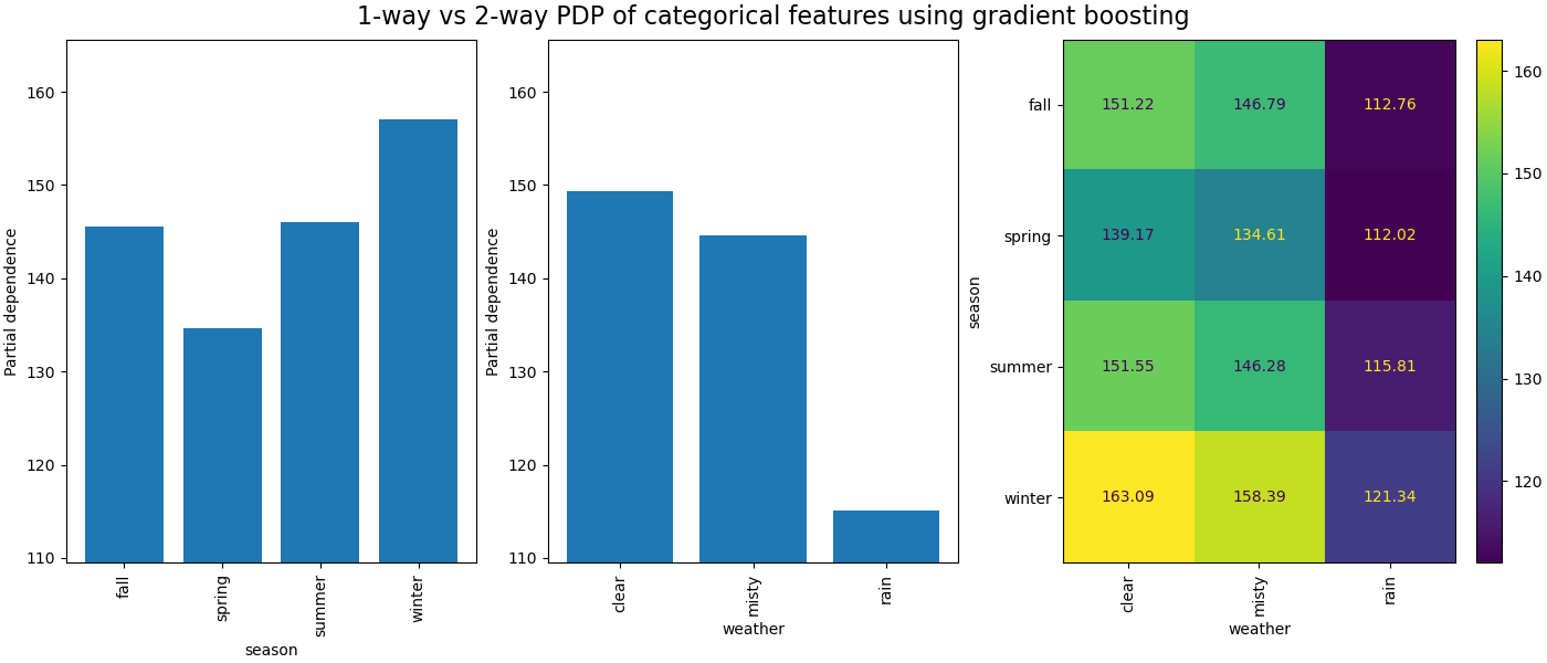
我们观察到春季是季节特征的最低条。对于天气特征,雨天类别是最低条。关于小时特征,我们看到上午 7 点和下午 6 点左右有两个高峰。这些发现与我们之前对数据集的观察一致。
然而,值得注意的是,如果特征相关,我们可能会创建没有意义的合成样本。
ICE 与 PDP#
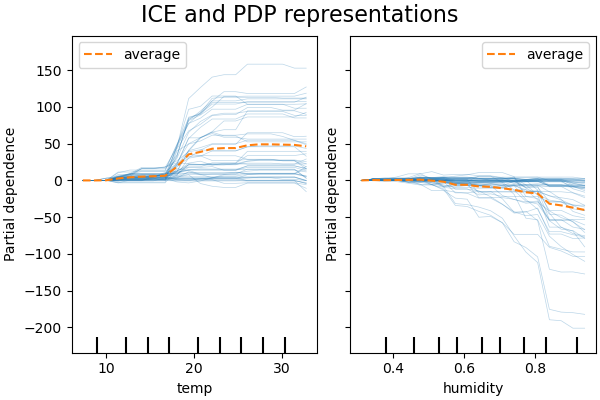
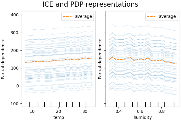
PDP 是特征边际效应的平均值。我们对所提供集合的所有样本的响应进行平均。因此,一些效应可能会被隐藏。在这方面,可以绘制每个个体响应。这种表示称为个体效应图 (ICE)。在下图中,我们绘制了温度和湿度特征的 50 个随机选择的 ICE。
print("Computing partial dependence plots and individual conditional expectation...")
tic = time()
_, ax = plt.subplots(ncols=2, figsize=(6, 4), sharey=True, constrained_layout=True)

features_info = {
    "features": ["temp", "humidity"],
    "kind": "both",
    "centered": True,
}

display = PartialDependenceDisplay.from_estimator(
    hgbdt_model,
    X_train,
    **features_info,
    ax=ax,
    **common_params,
)
print(f"done in {time() - tic:.3f}s")
_ = display.figure_.suptitle("ICE and PDP representations", fontsize=16)
Computing partial dependence plots and individual conditional expectation...
done in 0.394s
我们看到温度特征的 ICE 提供了额外信息:一些 ICE 线是平坦的,而另一些则显示温度高于 35 摄氏度时依赖性下降。我们观察到湿度特征也存在类似模式:当湿度高于 80% 时,一些 ICE 线显示急剧下降。
并非所有 ICE 线都是平行的,这表明模型发现了特征之间的交互。我们可以通过使用参数 interaction_cst 限制梯度提升模型不使用任何特征之间的交互来重复实验。
from sklearn.base import clone

interaction_cst = [[i] for i in range(X_train.shape[1])]
hgbdt_model_without_interactions = (
    clone(hgbdt_model)
    .set_params(histgradientboostingregressor__interaction_cst=interaction_cst)
    .fit(X_train, y_train)
)
print(f"Test R2 score: {hgbdt_model_without_interactions.score(X_test, y_test):.2f}")
Test R2 score: 0.38
_, ax = plt.subplots(ncols=2, figsize=(6, 4), sharey=True, constrained_layout=True)

features_info["centered"] = False
display = PartialDependenceDisplay.from_estimator(
    hgbdt_model_without_interactions,
    X_train,
    **features_info,
    ax=ax,
    **common_params,
)
_ = display.figure_.suptitle("ICE and PDP representations", fontsize=16)
二维交互图#
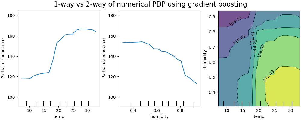
具有两个感兴趣特征的 PDP 使我们能够可视化它们之间的交互。然而,ICE 无法轻易绘制和解释。我们将展示 from_estimator 中可用的表示,即 2D 热图。
print("Computing partial dependence plots...")
features_info = {
    "features": ["temp", "humidity", ("temp", "humidity")],
    "kind": "average",
}
_, ax = plt.subplots(ncols=3, figsize=(10, 4), constrained_layout=True)
tic = time()
display = PartialDependenceDisplay.from_estimator(
    hgbdt_model,
    X_train,
    **features_info,
    ax=ax,
    **common_params,
)
print(f"done in {time() - tic:.3f}s")
_ = display.figure_.suptitle(
    "1-way vs 2-way of numerical PDP using gradient boosting", fontsize=16
)
Computing partial dependence plots...
done in 6.743s
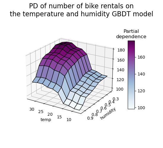
二维偏依赖图显示了自行车租赁数量与温度和湿度共同值之间的依赖关系。我们清楚地看到这两个特征之间的相互作用。当温度高于 20 摄氏度时,湿度对自行车租赁数量的影响似乎与温度无关。
另一方面,当温度低于 20 摄氏度时,温度和湿度都持续影响自行车租赁数量。
此外,20 摄氏度阈值影响峰的坡度非常依赖于湿度水平:在干燥条件下,峰很陡峭,但在湿度高于 70% 的潮湿条件下,峰则平滑得多。
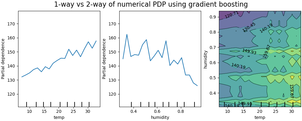
现在我们将这些结果与针对受限模型计算的相同图进行对比,该模型受限学习一个不依赖于此类非线性特征交互的预测函数。
print("Computing partial dependence plots...")
features_info = {
    "features": ["temp", "humidity", ("temp", "humidity")],
    "kind": "average",
}
_, ax = plt.subplots(ncols=3, figsize=(10, 4), constrained_layout=True)
tic = time()
display = PartialDependenceDisplay.from_estimator(
    hgbdt_model_without_interactions,
    X_train,
    **features_info,
    ax=ax,
    **common_params,
)
print(f"done in {time() - tic:.3f}s")
_ = display.figure_.suptitle(
    "1-way vs 2-way of numerical PDP using gradient boosting", fontsize=16
)
Computing partial dependence plots...
done in 6.157s
受限模型(不建模特征交互)的一维偏依赖图显示了每个特征的局部尖峰,特别是“湿度”特征。这些尖峰可能反映了模型行为的退化,它试图通过过度拟合特定训练点来某种程度上补偿被禁止的交互。请注意,该模型在测试集上测得的预测性能明显差于原始未受限模型。
另请注意,这些图上可见的局部尖峰数量取决于 PD 图本身的网格分辨率参数。
这些局部尖峰导致了噪声网格化的二维 PD 图。由于湿度特征中的高频振荡,很难判断这些特征之间是否存在交互。然而,可以清楚地看到,当温度跨越 20 度边界时观察到的简单交互效应在此模型中不再可见。
分类特征之间的偏依赖将提供离散表示,可以显示为热图。例如,季节、天气和目标之间的交互将如下所示
print("Computing partial dependence plots...")
features_info = {
    "features": ["season", "weather", ("season", "weather")],
    "kind": "average",
    "categorical_features": categorical_features,
}
_, ax = plt.subplots(ncols=3, figsize=(14, 6), constrained_layout=True)
tic = time()
display = PartialDependenceDisplay.from_estimator(
    hgbdt_model,
    X_train,
    **features_info,
    ax=ax,
    **common_params,
)

print(f"done in {time() - tic:.3f}s")
_ = display.figure_.suptitle(
    "1-way vs 2-way PDP of categorical features using gradient boosting", fontsize=16
)
Computing partial dependence plots...
done in 0.331s
三维表示#
让我们为 2 个特征交互制作相同的偏依赖图,这次是 3 维的。
# unused but required import for doing 3d projections with matplotlib < 3.2
import mpl_toolkits.mplot3d  # noqa: F401
import numpy as np

from sklearn.inspection import partial_dependence

fig = plt.figure(figsize=(5.5, 5))

features = ("temp", "humidity")
pdp = partial_dependence(
    hgbdt_model, X_train, features=features, kind="average", grid_resolution=10
)
XX, YY = np.meshgrid(pdp["grid_values"][0], pdp["grid_values"][1])
Z = pdp.average[0].T
ax = fig.add_subplot(projection="3d")
fig.add_axes(ax)

surf = ax.plot_surface(XX, YY, Z, rstride=1, cstride=1, cmap=plt.cm.BuPu, edgecolor="k")
ax.set_xlabel(features[0])
ax.set_ylabel(features[1])
fig.suptitle(
    "PD of number of bike rentals on\nthe temperature and humidity GBDT model",
    fontsize=16,
)
# pretty init view
ax.view_init(elev=22, azim=122)
clb = plt.colorbar(surf, pad=0.08, shrink=0.6, aspect=10)
clb.ax.set_title("Partial\ndependence")
plt.show()
自定义检查点#
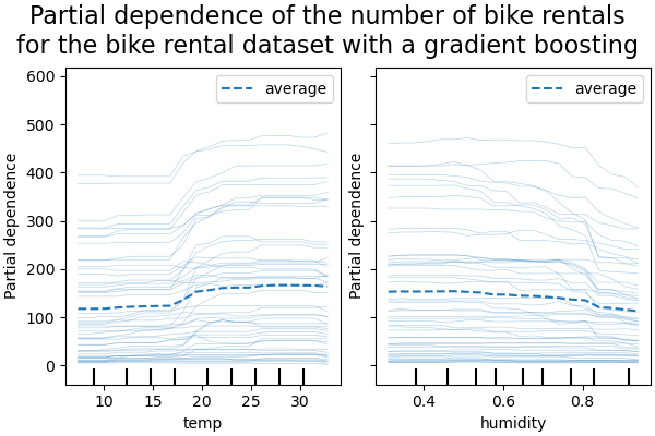
到目前为止,所有示例都未指定评估哪些点来创建偏依赖图。默认情况下,我们使用输入数据集定义的分位数。在某些情况下,指定模型需要评估的确切点会很有帮助。例如,如果用户想测试模型在分布外数据上的行为或比较在略有不同的数据上拟合的两个模型。参数 custom_values 允许用户传入他们希望模型评估的值。这会覆盖 grid_resolution 和 percentiles 参数。让我们回到上面的梯度提升示例,但使用自定义值。
print("Computing partial dependence plots with custom evaluation values...")
tic = time()
_, ax = plt.subplots(ncols=2, figsize=(6, 4), sharey=True, constrained_layout=True)

features_info = {
    "features": ["temp", "humidity"],
    "kind": "both",
}

display = PartialDependenceDisplay.from_estimator(
    hgbdt_model,
    X_train,
    **features_info,
    ax=ax,
    **common_params,
    # we set custom values for temp feature -
    # all other features are evaluated based on the data
    custom_values={"temp": np.linspace(0, 40, 10)},
)
print(f"done in {time() - tic:.3f}s")
_ = display.figure_.suptitle(
    (
        "Partial dependence of the number of bike rentals\n"
        "for the bike rental dataset with a gradient boosting"
    ),
    fontsize=16,
)
Computing partial dependence plots with custom evaluation values...
done in 0.403s
脚本总运行时间: (0 分 20.237 秒)


相关示例